

Cha Cha Noi
Branding/Identity
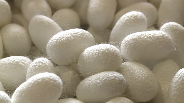
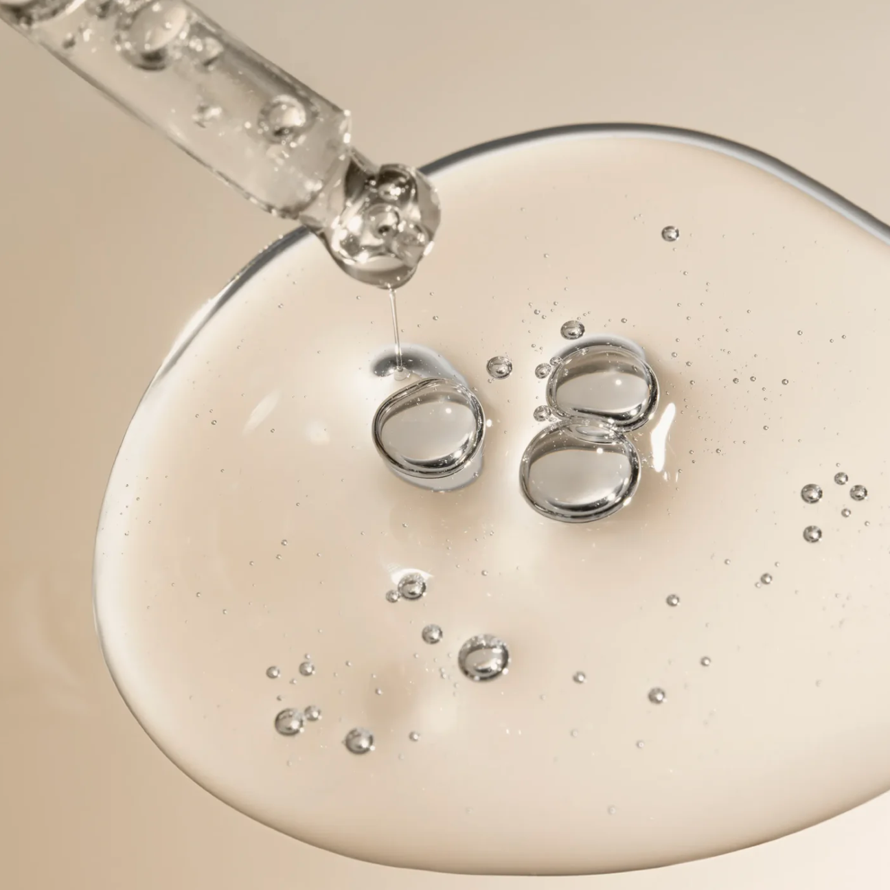
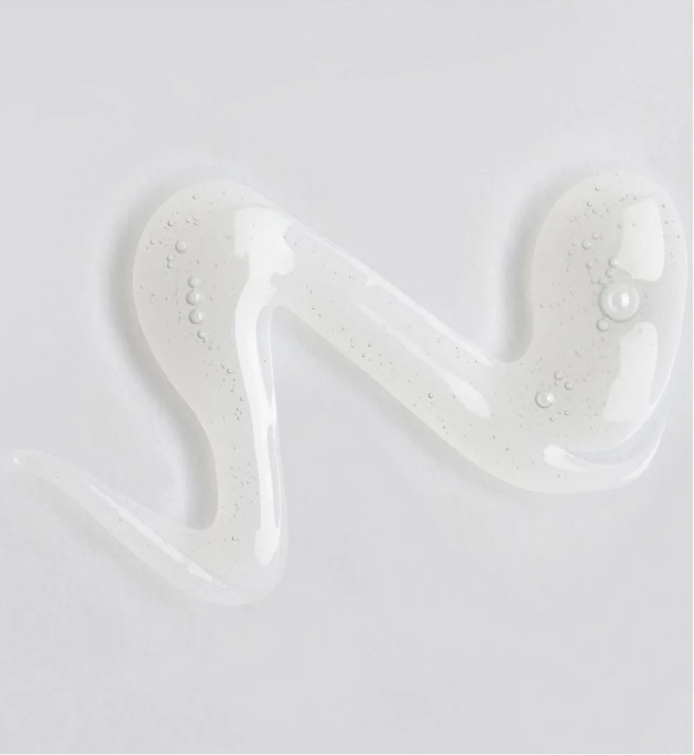
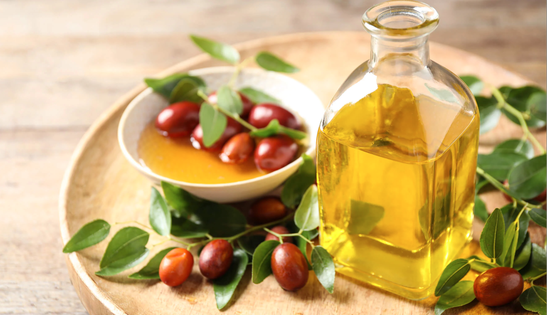
Cha Cha Noi is a comprehensive self-care brand that celebrates Thailand's beauty, biodiversity, and traditional self-care practices. Combining traditional Thai ingredients like silkworm cocoons with innovative technology offers premium face, body, and self-care products designed to nourish the soul and the senses. The name, Cha Cha Noi, translates to "slow down a little" in Thai, reflecting the brand's philosophy.

Mission:
Design a luxury brand that resonates with customers who not only take the time to invest in self-care, but also in tradition and sustainability.


Challenge:
My design partner and I wanted to design more than just a logo, but a brand that lives through complexity in simplicity–being able to integrate the brand’s story seamlessly, minimally, and strikingly.
Mindfulness
Consistency
Simplicity
Core Values:
At the heart of Cha Cha Noi is a reverence for presence. Inspired by Thailand’s rich self-care traditions, the brand invites a return to ritual. Soft spacing, breathable layouts, and calming typography reflect the philosophy of slowing down. Consistency becomes an act of self-respect; cultivating trust, patience, and visible transformation over time. This translates into structured systems, clean grids, and a reliable product hierarchy. By balancing traditional Thai influence with modern refinement, the identity feels pure, elegant, and accessible.
Inspiration:
Aside from researching competing luxury brands and products, we found that to integrate Cha Cha Noi’s story, we had to examine the cultural and traditional aspects. We learned that skincare is not an option, but a ritual. It becomes a moment of meditation where the focus is on rejuvenating, renewing, and remediating.
Solution & Vision:
To achieve our vision, we integrated culture with grace and simplicity using a minimal and impactful typeface. The structure needs to be legible, unique, and follow a rhythm of slowing down.
Typography:
Fahkwang is a high-contrast Thai and Latin sans serif typeface created by Cadson Demak, the first Thai communication design firm. Drawing inspiration from headlines in vintage Thai newspapers, this modern typeface retains a contemporary feel while incorporating cultural elements from its origins. It is intended primarily for display purposes. It can be downloaded here.
Color Palette:
The primary color palette will serve as the core representation of the brand identity. This palette embodies the essence of self-care through soothing and focused hues, drawing inspiration from the themes of sunrises and sunsets. Color usage should adhere to the established hierarchy, with indigo as the primary color and lavender and raspberry as secondary colors. Neutral tones, represented by off-white and off-black, provide alternatives to standard white and black, complementing the soft color palette and enhancing readability.
Accompanying the color swatches are various ombre combinations that capture the beautiful interplay of nature’s light, a key focus for the client. They can be utilized across products, packaging, and web applications.
CMYK: 77.71.53.54
RGB: 46.46.58
HEX: #2E2E3A
CMYK: 91.91.28.16
RGB: 58.52.106
HEX: #3A346A
CMYK: 54.51.0.0
RGB: 127.126.188
HEX: #7F7EBC
CMYK: 7.6.14.
RGB: 236.232.218
HEX: #ECE8DA
Final design:
PRIMARY LOGO: The final design features a logotype displayed in the Fahkwang typeface, styled in book-format characters. This logo blends seamlessly into the world of luxury skincare and cosmetics while honoring the brand’s heritage and subtle richness.
SECONDARY LOGO: This offers a playful and modern visual representation of the brand. More applicable to products and other packaging options where space is not limited.
ICONOGRAPHY: The smallest, most minimal logo can sometimes be the most impactful. The icon represents the all-encompassing process of skincare.