

My Brand’s Story
A big part of my identity is rooted in my parents. Both of my parents were born in Mexico. My mom was born in San Miguel el Alto, Jalisco, and my dad was born in San Jose de los Reynoso, Jalisco. They found each other in the motherland. When they were pregnant with my oldest brother, they sacrificed leaving everything they knew and everyone they loved behind to provide the best life they could imagine for their family.
If I am resilient, it’s because, as a unit, we remained strong. If I am adaptable, it’s because I molded to my forever-changing environments. And if I am radiant, it’s because, through it all, I am the fruit of my parents’ labor and selflessness.
To create bold, intentional design that builds confidence and connection by blending strategy, culture, and storytelling.
Mission:
Challenge:
This design challenge asked how my culture, personality, and identity could be embedded within a logotype, allowing design to communicate emotion, familiarity, and recognition beyond words.
Legacy
Community
Culture
Core Values:
Every project is treated as an extension of someone’s livelihood, story, and legacy. This guides me to create thoughtful, dependable design that honors where a brand comes from and where it’s going. I see design as a tool for empowerment, one that helps small businesses and individuals be seen, understood, and feel confident in their brand. In doing this, I create work that resonates across communities while remaining authentic to its roots.
Inspiration:
I was inspired by typographic logos for their clarity and simplicity. I wanted to mirror the value of family within the logo so it’s intentional, dependable, and built to last.
While Mexican culture has a heavy influence, I have also drawn inspiration from my surroundings in Chicago. As conventional visual art captures the attention of most viewers, I connected with the unconventional art of abstract typography—graffiti.
The boldness of graffiti informs presence and confidence. It represents community, visibility, voice, and the act of taking up space in environments where presence is often overlooked. Its influence brings strength, expression, and unapologetic identity to the design.
Structural Breakdown:
My name has lived in many forms. It has been reshaped, reinterpreted, and pronounced differently depending on the space I’m in. Just as I am a product of two cultures, my name carries that same duality.
Dia reflects my Mexican heritage, while Nely carries a more American influence. While this division may not have been intentional at the time I was named, it has become a natural framework for how I navigate between cultures.
I also go by Dee as a way to create ease and approachability in spaces where my full name may feel unfamiliar. It became a way for me to navigate through different spaces comfortably while still maintaining connections without friction.
This duality directly informs my design approach, where contrast, balance, and unity are not just visual decisions but reflections of lived experience.
Solution & Vision:
The solution was a bold typographic logotype rooted in culture and contrast with the intention to feel strong, welcoming, and unforgettable.
Mighty Slab was chosen as the foundation of my logotype because it reflects the strength, confidence, and bold presence I want my brand to communicate. Its slab serif structure feels grounded and dependable. It’s something built to last.
Its heavy weight and strong letterforms give the logotype a powerful display quality, echoing the visual boldness found in graffiti culture. The use of a serif typeface introduces tradition and continuity, bridging generations and cultures. By combining expressive and structured influences, the logotype becomes a unifying display; one that balances refinement with boldness and reflects the harmony between heritage and modern expression.
It allows the logo to feel both structured and expressive, making it approachable, recognizable, and unapologetically present.
Typography:
Color Palette:
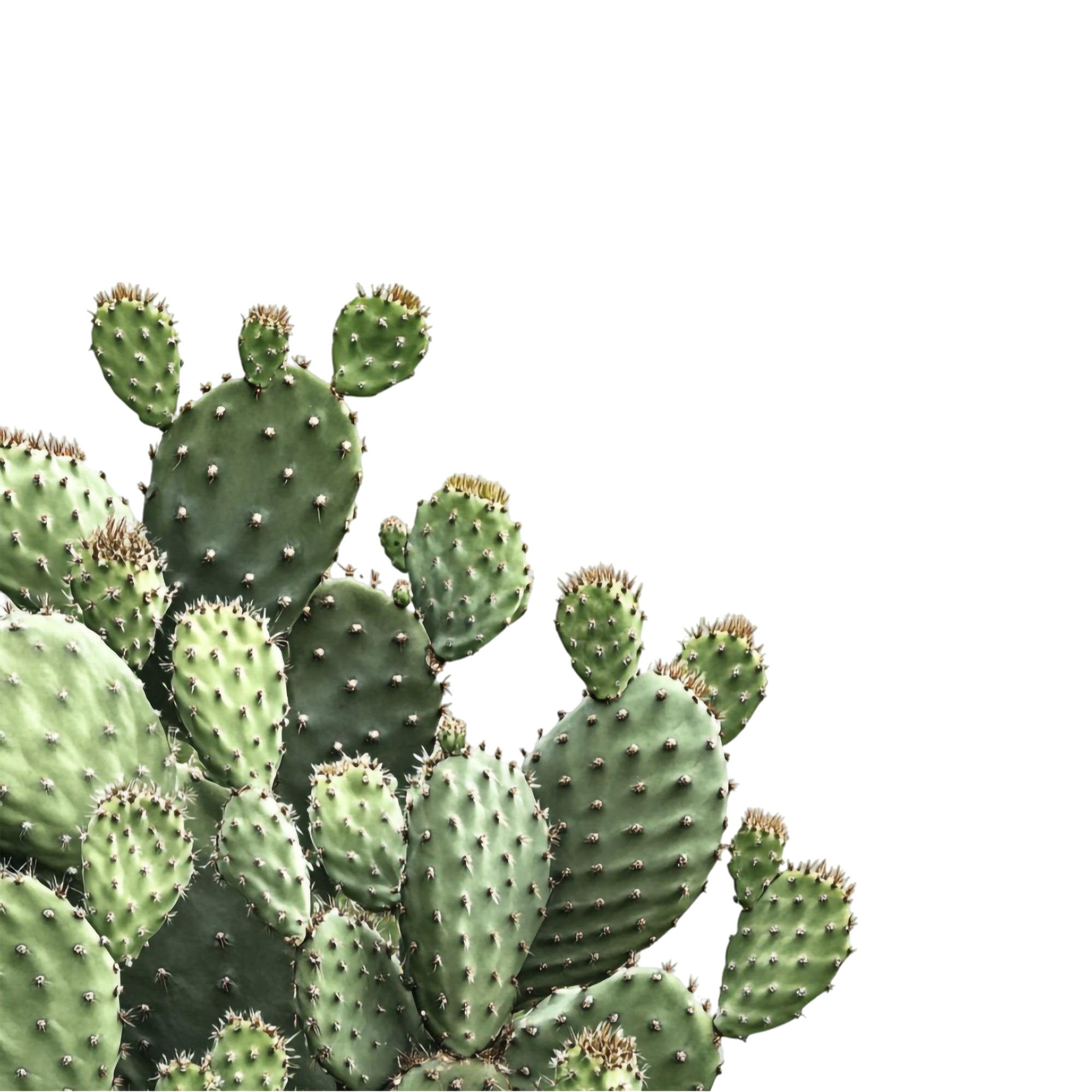
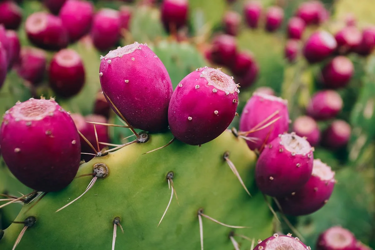
This palette was curated to feel welcoming, grounded, and present. In honor of my heritage, culture, and bloodline, I chose Spanish words that reflect my origins. Tierra represents the soil from which I grew and the foundation my parents nurtured to create opportunity. Nopal symbolizes resilience and growth, even in the toughest conditions. Sabia represents wisdom carried through experience and passed down through generations. Corazón reflects the love I’ve felt through the sacrifices made in pursuit of the American dream. Lastly, Alma represents the soul poured into my culture and identity.
The palette itself remains minimal and intentional, steering away from traditional black and white. Instead of using harsh true black, I chose a deep, muted chocolate tone that feels warmer and more inviting, while the white is a soft, creamy shade that feels more approachable rather than stark contrast. Two variations of green reinforce growth and rootedness, while a bold pop of pink adds contrast and energy, bringing tradition and contemporary expression into balance.
Final Design:
PRIMARY LOGO: Visually representative of cultural duality through color.
SECONDARY LOGO: Designed to take up space, to be more than simple.
ICONOGRAPHY: More than just a letter, but another name people know me by. Designed to feel familiar in any space.